[vc_row][vc_column][vc_column_text]Designing with C.R.A.P :The four principles of good design.
Created by Robin Williams, the main message is the proper use of Contras, Repetition, Alignment and Proximity (CRAP) in everything you create.
Contrast
Use contrast to direct the viewer’s attention and create distinction between elements. A lack of contrast can make designs look difficult to navigate. Contrast should be used for both graphical and typographical elements.
Repetition
Repetition is the key to attractive, consistent designs. Repeat colors, text treatments, and graphics to create visual connections and establish a strong visual style.
Alignment
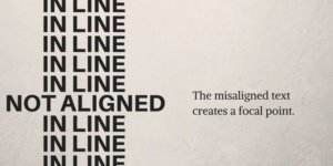
Every item on your page should be intentionally positioned, not arbitrarily placed. Line up objects where appropriate both vertically and horizontally. Remember that alignments are a communication tool.
Proximity
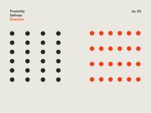
The principle of proximity states that objects or statements that are related belong together on the page.
Get familiar with these simple but very significant design principles and concepts, and you will be a better designer!
We are experts in effective and creative design. Send us an email to start working with us: creative@vaqueroadvertising.com[/vc_column_text][/vc_column][/vc_row]


